I’ve recently been working with a client in Woking who, after a big project to renovate the house, needed some help to lift the garden. They’d already installed the paving and brought in lots of mature specimen plants, but the garden just hadn’t really come to life and they didn’t feel very inspired to spend time out there.
The build phase of the garden is 3/4 of the way through now and the new garden is really starting to emerge. When I was there earlier this week my client, Peter, commented about the new structure and how I’d been right when I said it would feel much bigger if we divided up the space and gave it more structure and balance.
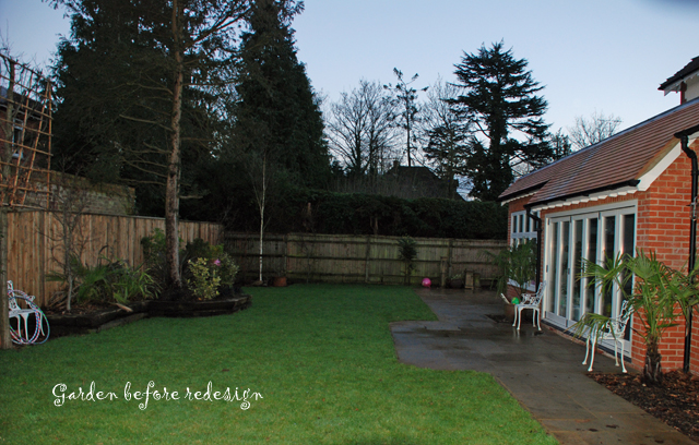
This is how the back garden looked when I first met my client…
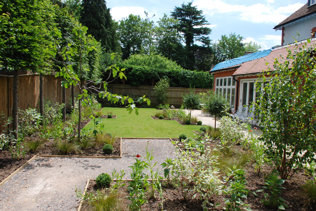
And as it is now – just the Breedon gravel to go in, fence to paint black and mulch to be applied and this area will be finished.
It’s a huge garden really but because the house is large and sits in the middle of the plot, it’s not until you get outside that you realise just how much space there is.
The key to good design is to get the balance right. The layout should work with the house and the confines of its boundaries so that you maximise the space and give each part of the garden a reason for being. It’s often difficult to ignore the boundaries, especially if these are panel or close board fences, but if you can try and think about designing the space from the inside out then you’ll be half way there.
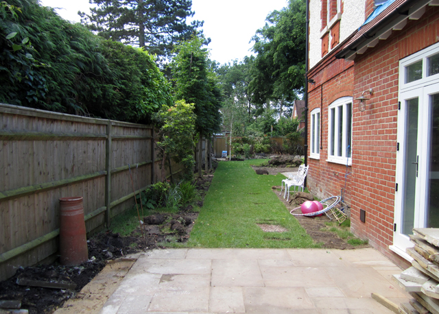
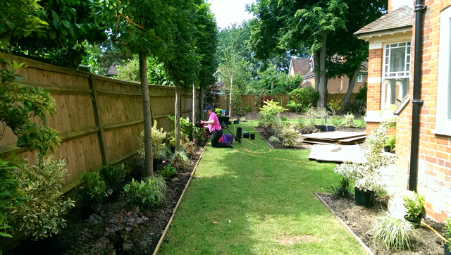
This is a view of the side garden shortly after it had been set out.
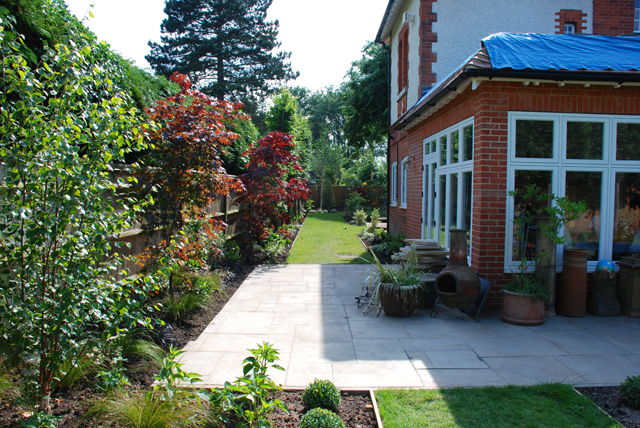
And now it looks like this – a bit of paving to extend and it will be finished but I hope you see the difference in the structure of the space.
In long thin spaces it’s often easier to work with a more geometric layout but that doesn’t mean you can’t create a space with a less formal feel to it. That’s where the plants come in – choose species that billow and encroach over the straight edges of a pathway and soon you’re left with a meandering pathway without any defined boundaries.
Good design is all about balance and it applies in all fields, from fashion to interior design to graphic design. Sometimes you just need a bit a help to see the space in a different light. When I approach the design of a new garden I don’t really start to get a feel for the space until I have a picture on paper of what’s there now and start moving my pencil across the paper.
The lesson for the day therefore is to think about the areas you want to create. A lawn, terrace or shady seating area maybe. Plan the shape you want them to be and try to ignore the boundaries. The bits leftover then become the flowerbeds – if they’re a funny shape, you really won’t notice once they’re filled with plants!


 Welcome