From the drawing board: Terrace redesign in Wandsworth 2 years on
4 Written by Lisa on 15th Aug 2013 in From the drawing boardI went to visit my client in Wandsworth earlier this week and the terrace was looking great – the planting has filled out now and it looks as though it’s always been there.
You may remember me blogging about it when the project was in progress – I redesigned the terrace area for them to help link their new extension to the rest of the garden.
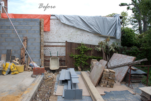
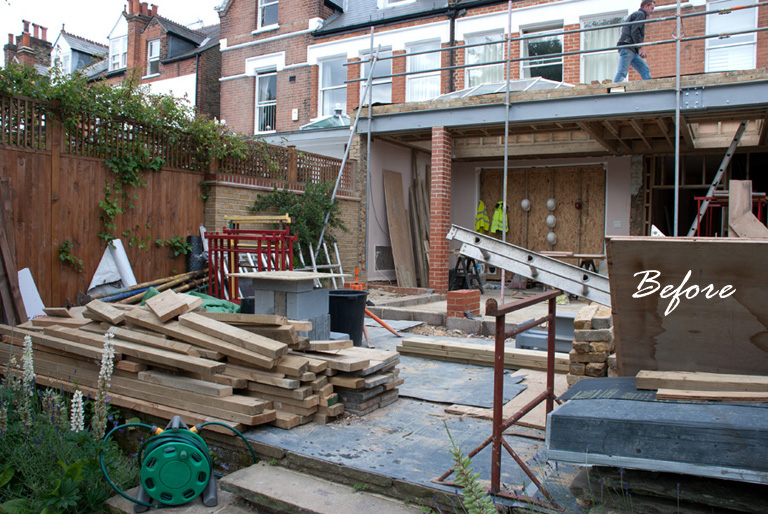
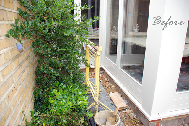
Here’s a reminder of how it looked before…
It’s a bit difficult to see what it was like because of the building materials, but there were some awkward corners and a couple of ugly walls to hide as well as a dog-leg return at the side where planning restrictions prevented them from building.
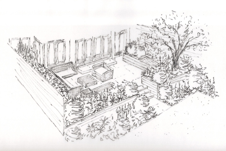
The design was structured to make the terrace an area in its own right but also the connecting space between the house and the rest of the garden. Here’s a reminder of the design sketch…
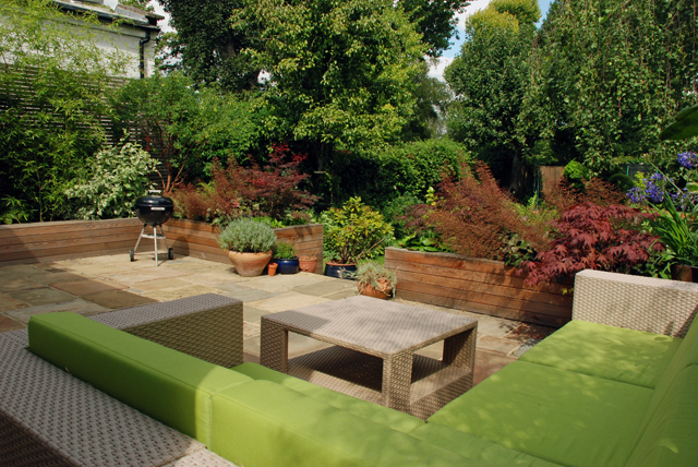
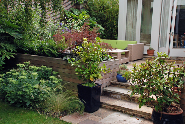
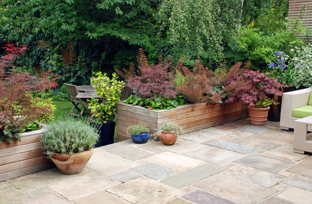
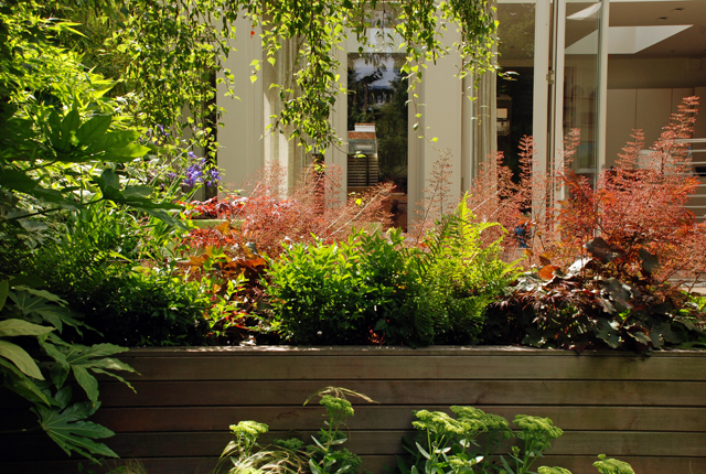
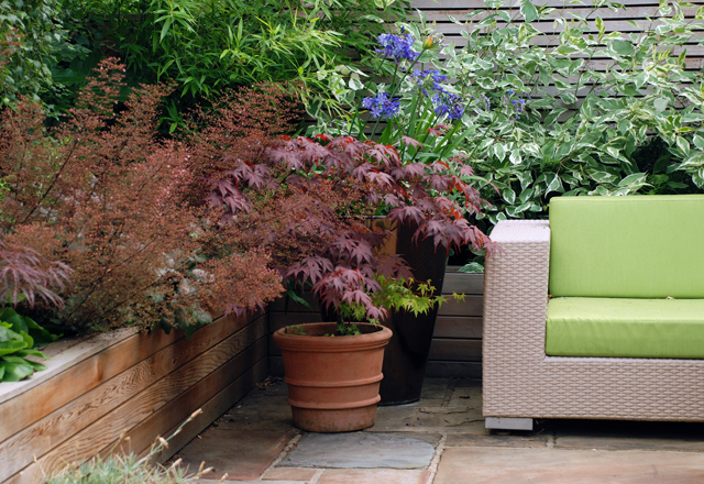
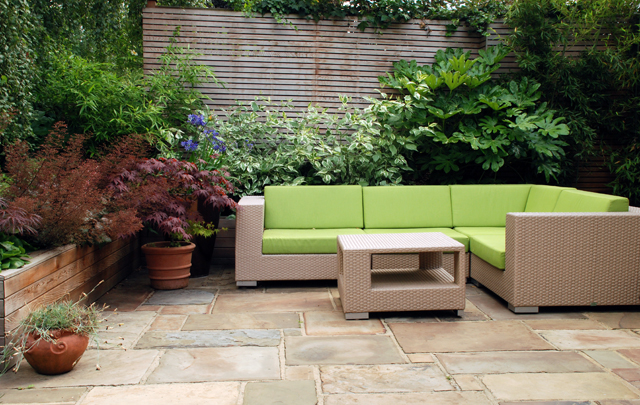
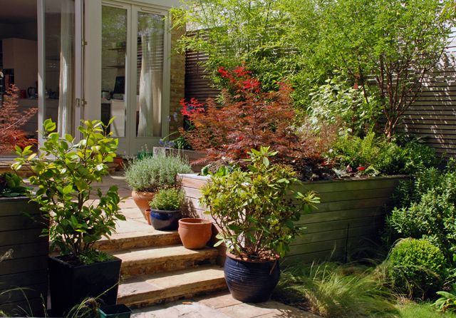
And here are a few images of how it looks now…
The timber raised beds serve as a barrier but also provide softness and structure around the terrace.
My clients wanted the emphasis to be on the foliage of the plants rather than the flowers so the ferns and heuchera give interest all year round.
The lounge furniture has a contemporary feel to it, which ties in perfectly with the interior of the house.
The horizontal contemporary trellis screens hide the ugly wall behind and provide a backdrop for the shrubs planted in the raised beds.
The York stone terrace was existing so other than building a threshold step to the house and a set of steps out onto the lawn, this remained unchanged.
It’s great to go back and see gardens when they’ve had chance to mature. They look good immediately after planting, but you never quite get the full effect until everything’s filled out.
(Images: Lisa Cox)


 Leave a comment
 Welcome