I am very excited to tell you that I have recently undertaken a course in Colour Psychology with Bernay Laity, Creative Director of In:Colour. I can honestly say that, as well as changing the way I approach my design work, my new found knowledge of colour and peoples responses to it has completely changed my life.
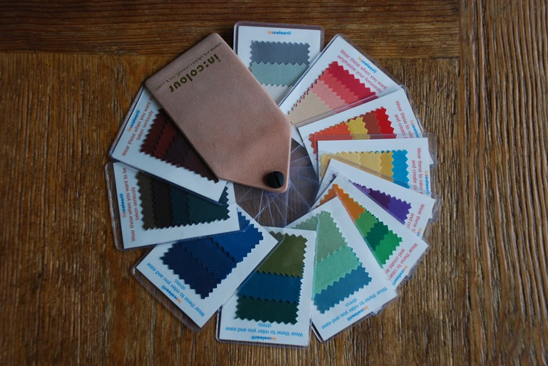
The process started when I was a case study for one of Bernay’s Personal Colour Psychology workshops where we established a family of colours that harmonise with my natural colouring (eyes, skin, hair etc).
Inevitably, this truly liberating experience got me thinking about how I might be able to apply colour psychology to my design work, could I look at peoples responses to colour when putting together a planting design for example. If someone wanted to feel calm and relaxed, what colours might I use to facilitate this feeling when that particular space is occupied? I was so fascinated that I approached Bernay about the possibility of doing some colour psychology work with her and she suggested a tailor-made course that would give me the tools to be able to apply colour psychology to my design work.
I spent 2 amazing days with Bernay learning about the power of colour psychology, how each colour has related psychological associations that we interpret and use unconsciously. How, once we know what each colour represents, we can use colour to consciously have influence on how we, our business and our surroundings make us/the people around us feel.
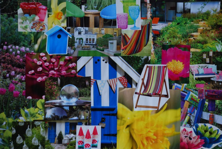
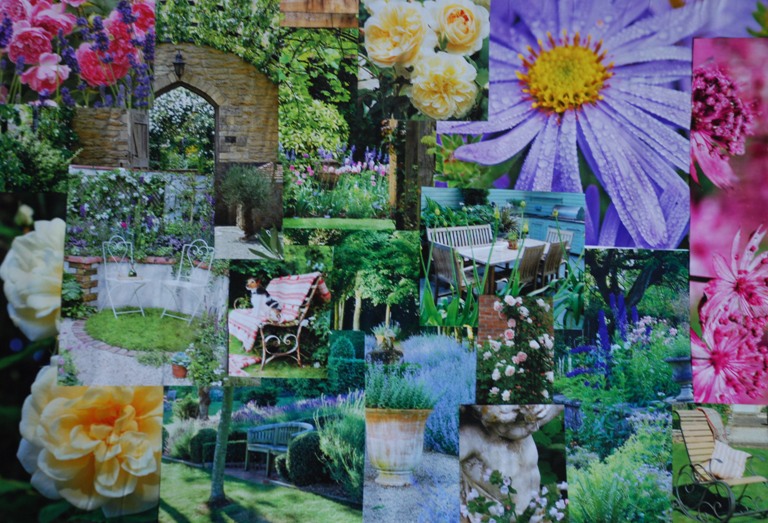
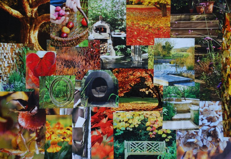
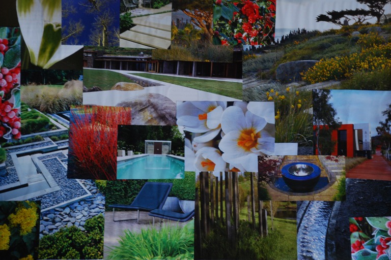
We also spent a time looking at the colour personalities (spring, summer, autumn and winter) and this is really where my new found knowledge is going to enhance the way I work with my clients. The best way to demonstrate this is to take you through each of the seasons – the mood boards I created will give you an idea of the garden elements that will appeal to each colour personality.
Spring
Springtime brings signs of new life. There is a feeling of excitement and new energy in the air and the colours surrounding us are bright and vibrant. The spring person is enthusiastic and bubbly, quick witted and always open to new ideas and they love to be with people and having fun. They like to be outside and free and favour a contemporary style – anything that’s “in vogue” but that has a sense of fun about it.
The Spring colour palette is warm, light and clear: sky blue; leaf green; fresh lilac; clear grey.
Summer
In summer nature slows down and the colours and textures soften and fade under the summer sun. It’s time to relax, enjoy holidays and long days.
Summer people have a dreamy, romantic quality. They love good quality and classic design and work calmly with great attention to detail, persevering to get the job done. They are quietly supportive and will be very sensitive to the needs of others around them. They prefer flowing lines and graceful soft patterns with an air of quality and materials that appeal to their sensitive side.
The summer palette is soft, muted and cool. The colours are sophisticated and have a greyish quality: slate blue; dusty rose; soft grey.
Autumn
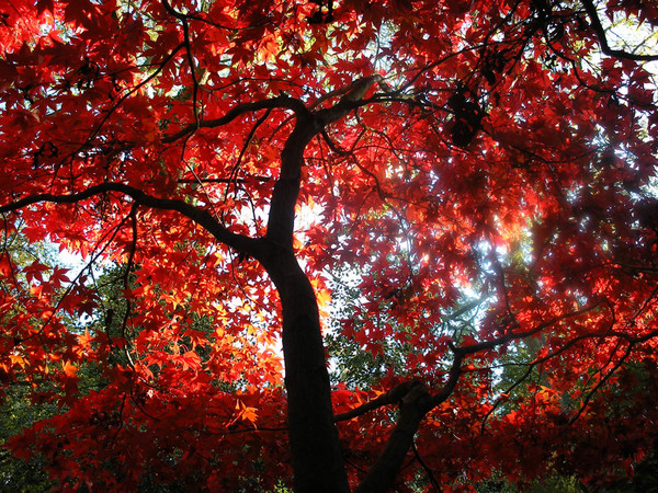
Autumn is warm and earthy and nature is alight with reds, ambers and browns. The leaves are falling and nights are drawing in, time to prepare to snuggle up.
The Autumn people are passionate, strong, warm, friendly and earthy. They are very interested in others and learning about the world and environment. They can appear a bit bossy or rebellious, but their natural enthusiasm and organised and practical nature makes them great leaders and campaigners. They prefer natural materials that are authentic, textured, earthy and comfy.
The Autumn palette is warm and intense: rich reds, forest green, peacock blue; warm browns.
Winter
Winter is the season of withdrawal. The landscape is dramatic, strong and contrasting. The colours are intense, clear and cool.
Winter people have a powerful stillness and strength and can command authority without saying a word. They are cool and objective and have confidence in their own abilities. They know what they want, are highly motivated and very ambitious. Their style is minimalistic, contemporary and glamorous with simplicity and structure. They appreciate open space and statement pieces and seek light reflective materials such as glass and steel.
The winter palette is dramatic and contrasting: crisp white, ice blue, acid yellow, shocking pink.
I can’t wait to utilise my new skills and apply them to the design process – do get in touch if you would like to know more, I’d love to hear from you!


 Leave a comment


 Welcome